Did you know that people make up their minds within 90 seconds of their initial interactions with people or products? And about 62-90% of the assessment is based on color alone.
Not only does color differentiates products from competitors it also can influence emotions – positively or negatively- and buyer’s attitude toward the products.

Considering that our emotions change from time to time, and the fact that colors can play a role in forming one’s attitude, it is important to understand colors to maximize products to its true potential!
After attentive research by OMNI GAMING, we will be exposing the findings of color manage through the perspective of color psychology. What are the color fundamentals, and what is the influence of and how does these color significance influence in gambling?
Color Fundamentals
To understand color, we must get a little scientific right now, to understand how we see colors through our eyes. The creator of color is from light, carrying wavelength that is absorbed by the eyes while the brain converts into colors. There is a spectrum of six distinct colors from light: red, orange, yellow, green, blue and violet.

Red is the longest wavelength whereas violet obtains the shortest. Human eyes are comprised of cones and rods that allows us to perceive color and light, and there are 3 types of cones: type 1 is an association with blue, type 2 is green and type 3 is red. And other colors are a combination of these 3 main colors.
It is said that red is more stimulating and exciting; blue is more quiet and soothing colors. In terms of visibility warmer colors out-stand cooler colors, however yellow outperform all. The purest color has higher visibility than shades (color with black added) or tints (color with white added). So the higher contrast between two colors such as bright orange or yellow and black the greater the visibility.

From the scientific perspective we can understand that our human eye can distinct association better with a spectrum of 6 colors; red, orange, yellow, blue, violet, and green as the fundamental colors. So, by applying an image brand with these 6 main colors can defiantly make your brand image more vivid for consumer’s eye. But be careful with the matching colors! It has the possibility of pulling the main focus color away.
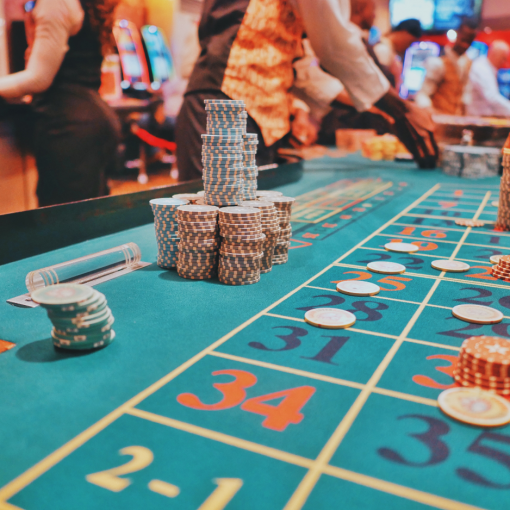
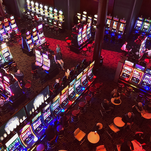
For example, if today your product is a slot game, and the color selection of wild, bonus feature or a big win can be these fundamental colors, and the background color can be the opposite color that makes the theme color more visible. Making an emphasis of winning association to the brain and create a strong near miss for players to be fully engaged.

Influence of Light
Studies from psychologists have also classified colors ‘red’ and ‘yellow’ as warm colors, and ‘blue’ and ‘green’ as cool colors, the distinction between warm and cool colors is relative; by using a cool color as background and warm color as title can distinctively identify the main message for title, however when red and yellow are dichotomized, yellow will appear warmer than red. And neutral colors are often white, gray, and black to our human eyes. Color creates a different mood according to consumer’s perception. Because color experiences vary from individual to another, each person’s rods detect a different type of light.

Lighting affects the perception of colors. To keep the consistency light decorations with colors is very crucial to how people perceive your brand image; It can directly influence your customer’s mood. Whether it’s the color of a retail store, or merely a product packaging, it is usually the electric light that allows these colors to be seen.
There are 2 major electrical lighting forms: incandescent and fluorescent lighting. Incandescent lighting enhance the warm colors while providing less appearance of cool colors. On the other hand, fluorescent lighting lacks the warm colors of the spectrum, but is used 67% worldwide; it enhances blue and green which makes red, orange, and yellow appear dull.

However red light can influence a person’s perception of the passage of time. Time passes slowly, and objects seem larger and heavier under the light influence of a red light. So, if you are considering in owning a casino, this is a principle you can make good use of – by using the red color lighting it creates an exciting atmosphere for players, and time well spent. On the contrary, when using blue light time seems to pass quite quickly and objects seem smaller and lighter.
Conclusion
Who knew that colors can have such influence on our brain psychologically, and how the lighting of the room also affects the way these colors are being perceived.
Today we have only discussed the fundamental of color’s impact, there is so much more color strategy to cultural ideologies and traditions, environmental color schemes in workplace how it affects morale and productivity; health care facility color can also affect patient’s recovery rates. How colors appeal in these aspects, and how do they affect customer behavior.
The use of color itself is not a guarantee to a successful business, but there are some significant encounters from a science perspective that can benefit your business in the smallest impact way. Using color as an element to your marketing portrays your brand image/product to a unique identity and leave other competitors monotonous.
References:
- Impact of color on marketing By Satyendra Singh
- The Psychology of Colour Influences Consumers’ Buying Behaviour – A Diagnostic Study J Suresh Kumar*
- Color Makes a better message by Geboy, Lyn Dally1